Tuesday Tips: What’s improved about your new chart look?

Tuesday Tips: What’s improved about your new chart look? December 22, 2015
We transitioned everyone to the new chart look last week, and hope that the changes have been benefiting you to faster and easier workflow.
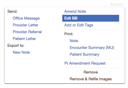
Specifically, we reformatted the Actions button on chart items for easier scanning and usability:
- Large menus on Visit Notes, Reports, and Medications are split into 2 columns to help you scan the options quickly.
- Similar actions (e.g. actions to send documents via message or letter, or actions to export data) are grouped together and placed in a consistent location.
- The “Remove” action is now red to help distinguish it from the other actions in the menu and lessen your chances of accidentally clicking it.

Check out more Tuesday tips by topic:Passport from your patient’s


